Client
Olympic Farms
Services
Brand System + Website — Logo design, brand style guide, business cards, and 5-page Squarespace website with e-commerce and blogging
Industry
Agriculture / Farm-to-Table / Cut Flowers
01 // THE CLIENT
Olympic Farms is an independent farm owned and operated by Tamara Amakobe — a founder with deep roots, a clear vision, and a passion for bringing fresh, intentional food directly to her community. Olympic Farms isn’t just a business. It’s a dream Tamara has been building toward, one that needed a brand worthy of everything she was pouring into it.
She came to Apple & Anchor ready. She knew what she was growing. She needed help showing the world.
━━━━━━━━━━━━━━━━━━━━━━━━━━━━━━━━━━━━━━━━
02 // WHERE THEY STARTED
Tamara had a business, a name, and a vision — but no visual identity, no brand language, and no online home. There was nothing yet to show someone who asked “do you have a website?” or “what does your brand look like?”
For a farm that wants to sell CSA subscriptions, build community around its produce, and tell an ongoing story through a journal, that gap matters. Customers buy from farms they trust. They trust what they can see, read, and feel. Without a brand, Olympic Farms was invisible to everyone except the people already in Tamara’s orbit.
The scope covered everything: logo design, a full brand style guide, business cards, a five-page Squarespace website with e-commerce integration for product and subscription sales, blogging capability, and post-launch training so Tamara could run it herself.
━━━━━━━━━━━━━━━━━━━━━━━━━━━━━━━━━━━━━━━━
03 // THE STRATEGIC INSIGHT
Farm brands tend to go one of two directions: rustic and hand-drawn (charming, but forgettable at scale) or overly corporate and clean (efficient, but cold). Neither felt right for what Tamara was building.
The insight that shaped everything: Olympic Farms isn’t just selling produce — it’s inviting people into a relationship with where their food comes from. That required a brand with warmth and personality, one that felt personal and trustworthy without feeling homespun. The kind of brand that could live on a CSA box, a farmers market banner, a website header, and an Instagram post and feel equally at home in all of them.
It also needed to work for e-commerce. Customers buying a CSA subscription online are making a commitment — they’re not just adding to a cart, they’re joining something. The brand needed to earn that trust before they ever clicked “subscribe.”
━━━━━━━━━━━━━━━━━━━━━━━━━━━━━━━━━━━━━━━━
04 // THE ANTI-BORING BRAND FRAMEWORK™ IN ACTION
EXCAVATE
We dug into what Olympic Farms means to Tamara — not just as a business, but as a calling. What came through was a deep sense of purpose around nourishment, community, and the dignity of growing things. This wasn’t a side hustle. It was a life’s work taking shape.
DISTILL
The brand truth: Olympic Farms brings people closer to the land and to their food — through beauty, intention, and the kind of care that shows in every detail, from seed to delivery. The brand needed to feel like Tamara: warm, grounded, and quietly extraordinary.
DIFFERENTIATE
In a market where farm brands often default to the expected — green, earthy, rustic — the opportunity was to be distinctive while still feeling rooted. A brand that had polish without pretension. One that could appeal to a CSA subscriber, a farmers market regular, and a first-time visitor to the website equally.
EXPRESS
The visual identity was designed to feel both timeless and alive — the kind of brand that looks like it’s been here a while and will be here long after.
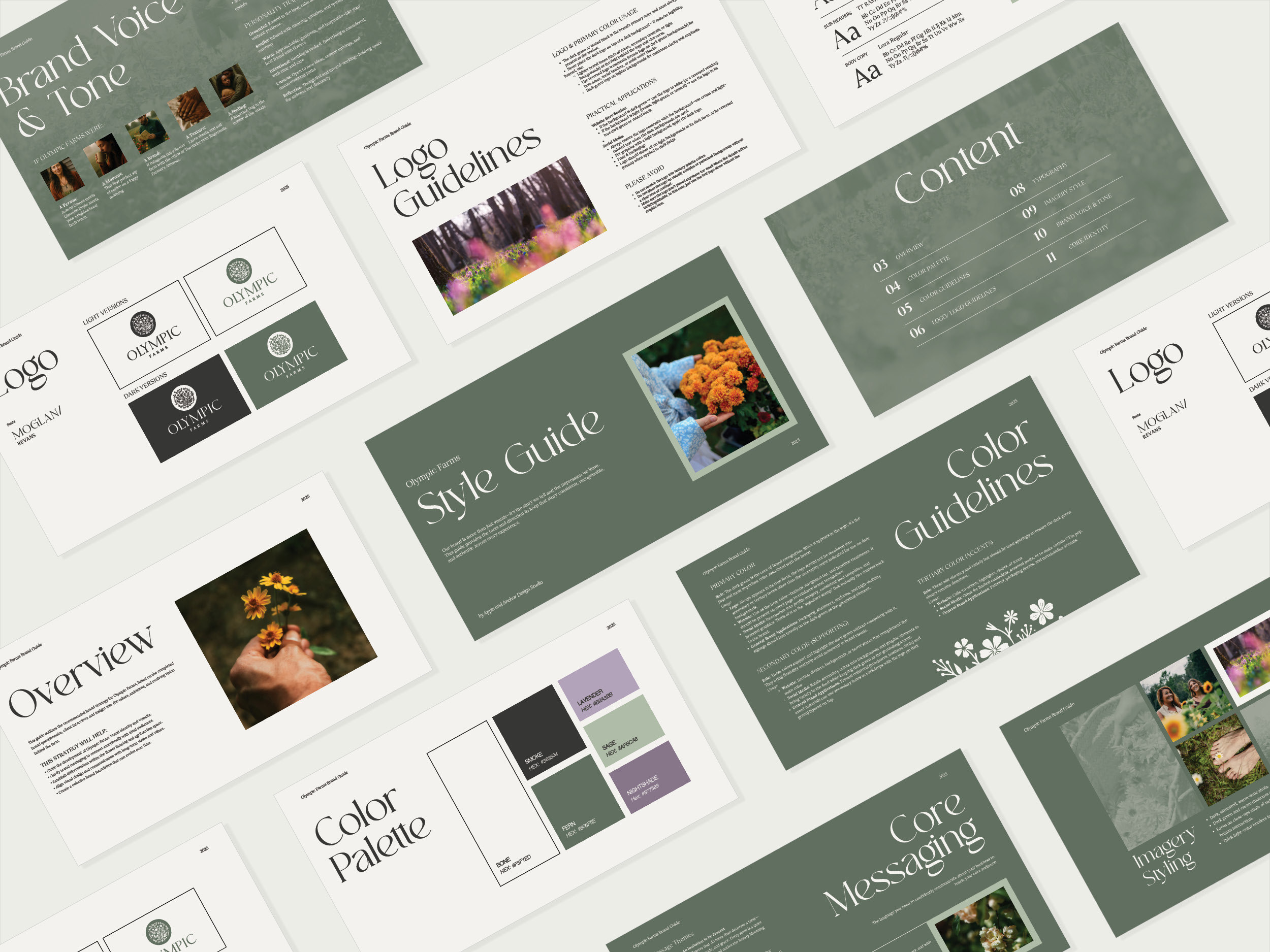
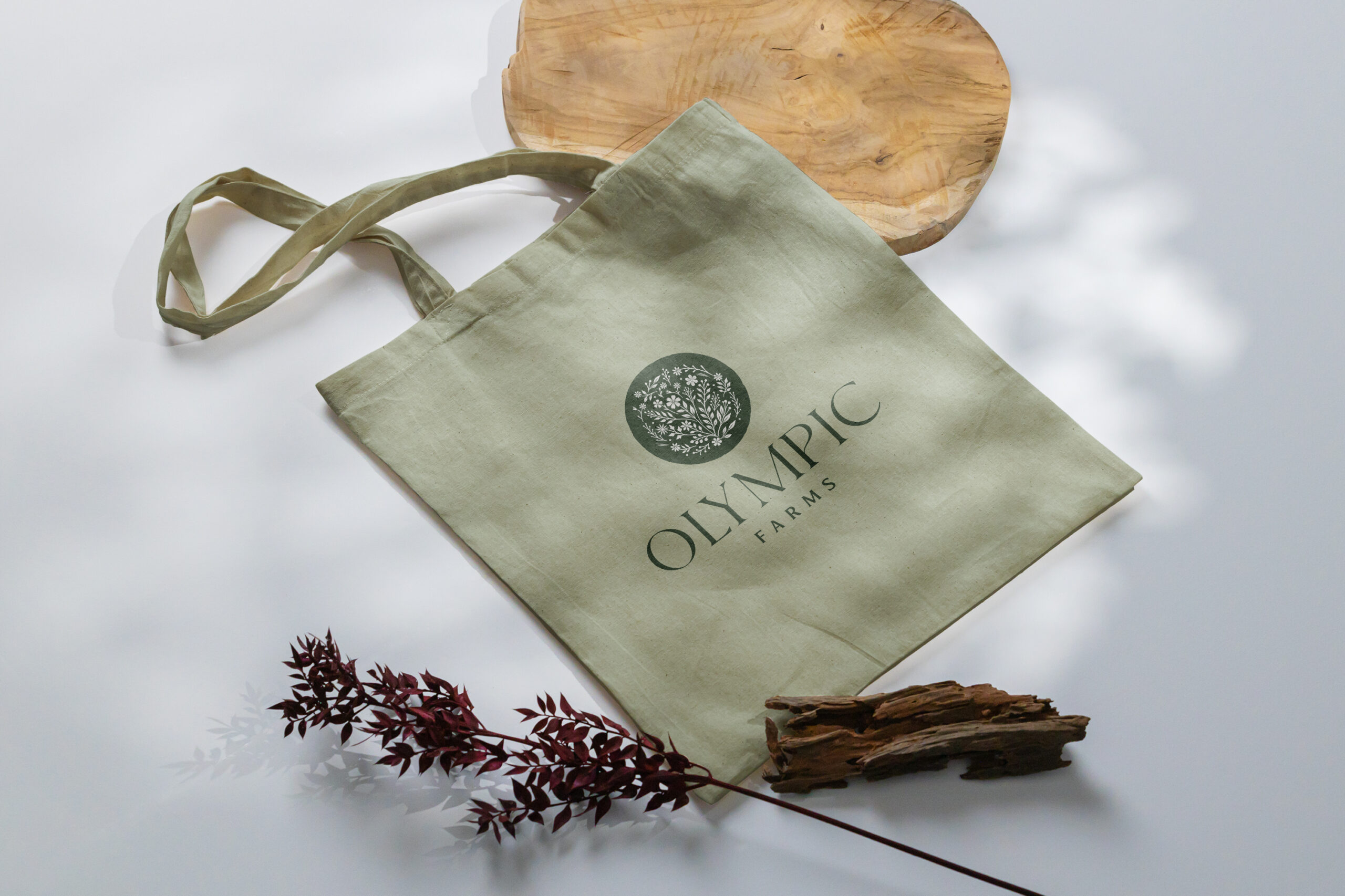
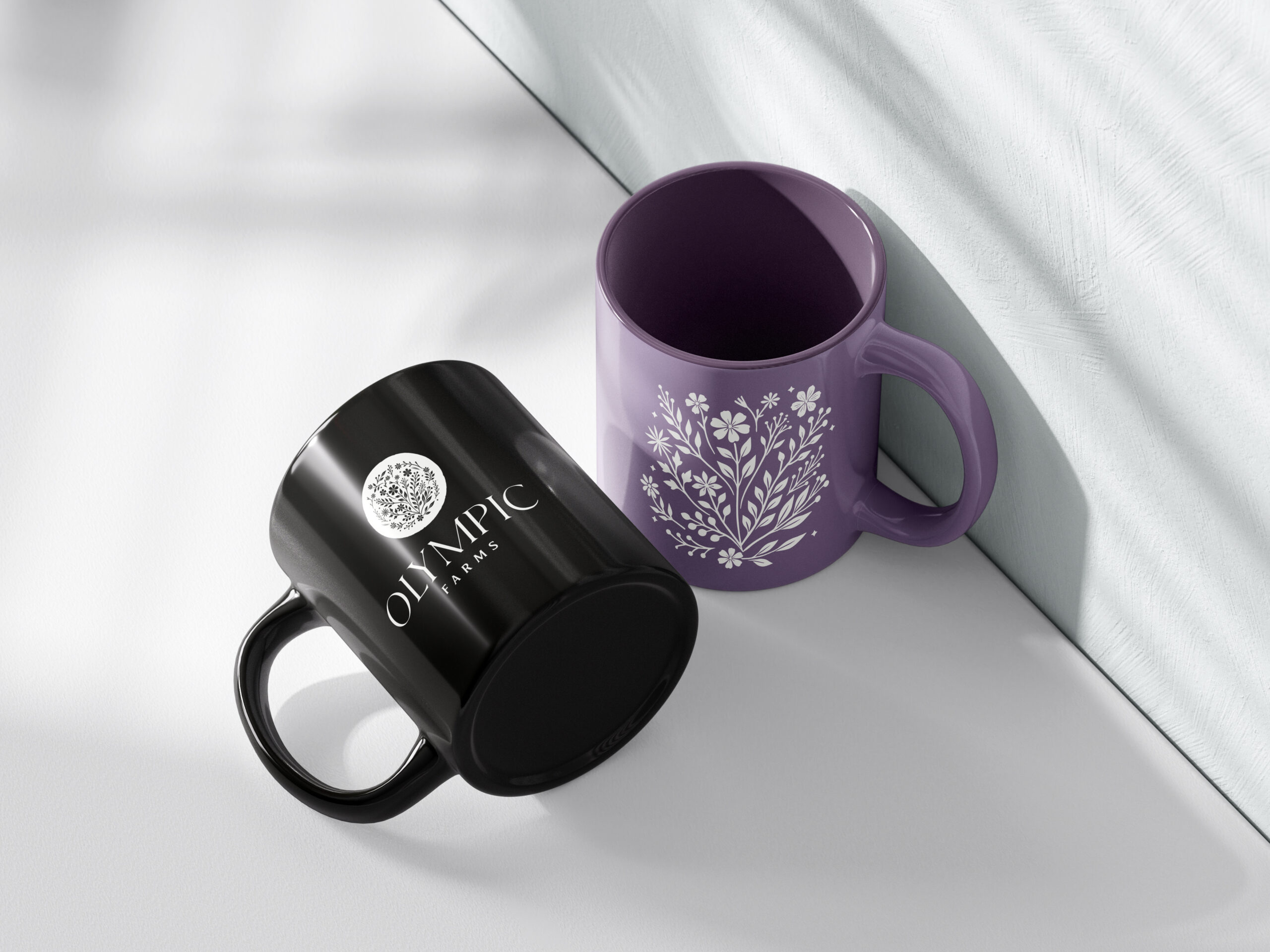
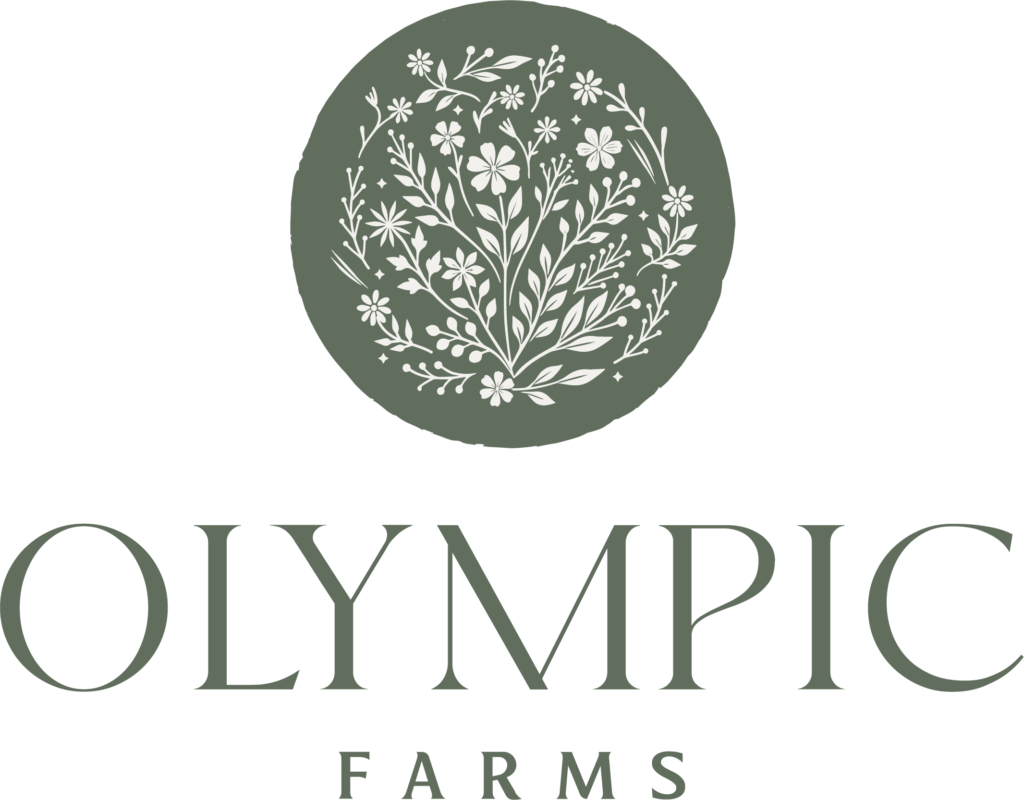
Logo suite: A refined circular botanical mark — wildflowers and foliage contained within a clean medallion form — paired with “OLYMPIC” set in Moglan and “FARMS” in Revans. Delivered in light and dark versions across four colorways, and in digital and print formats (JPEG, PNG, PDF, EPS), built to live beautifully on everything from product packaging to social media.
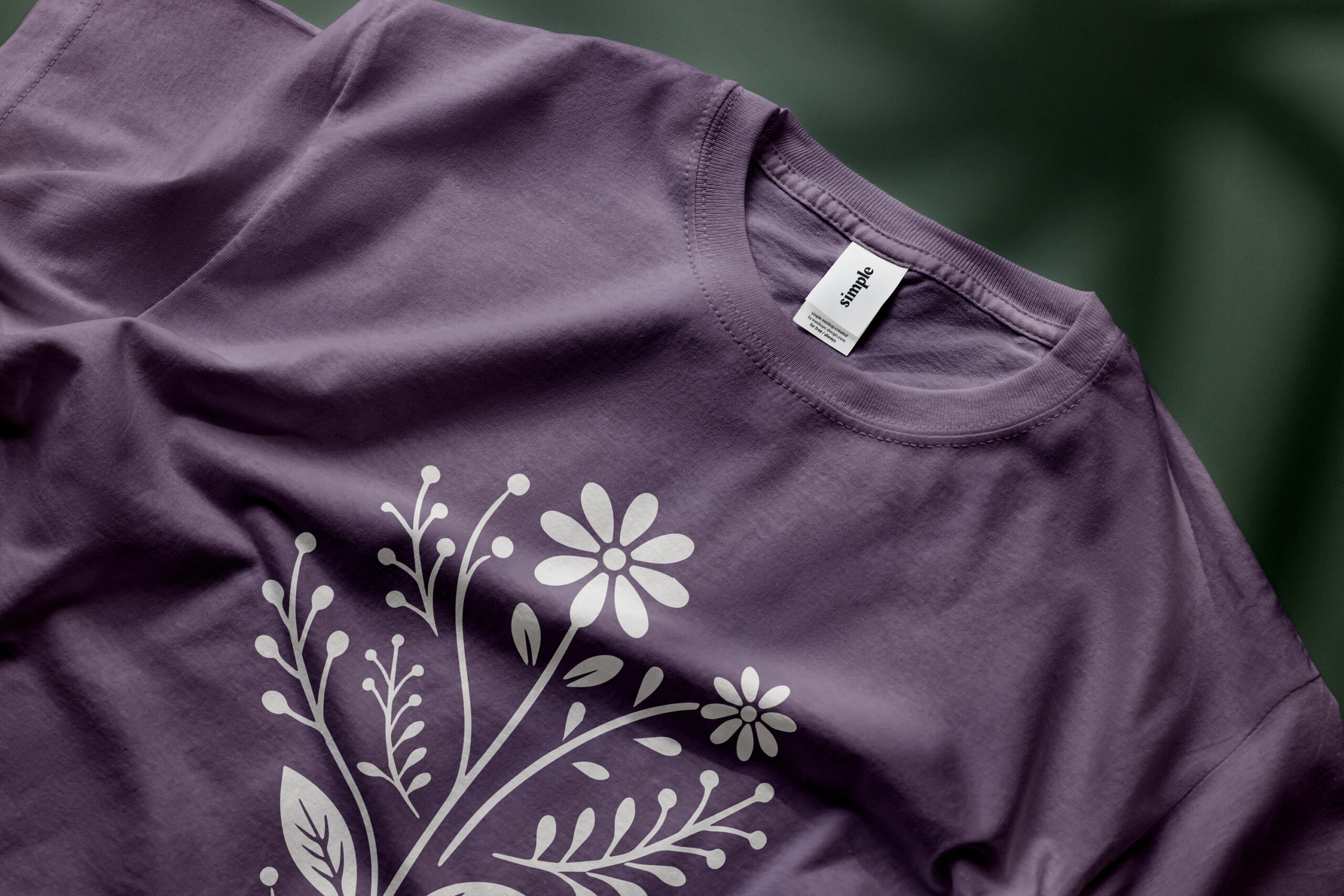
Color palette: A grounded, nature-forward system anchored by deep forest green — present in the logo and used as the primary brand color across all touchpoints. Supporting tones include Bone (warm off-white), Smoke (near-black), Sage (muted green), Lavender (dusty mauve), and Nightshade (deeper purple-grey), with clear guidance on primary, secondary, and accent usage.
Typography: NT Fabulous for headers brings soul and quiet elegance. TT Ramillas handles sub-headers with clean, modern weight. Lora Regular carries body copy with warmth and readability — a system that feels considered at every scale.
Brand style guide: Complete visual identity system covering color palette, typography, imagery guidelines, logo usage rules, and sample mockups — everything Tamara needs to show up consistently across every touchpoint.
Imagery direction: Dark, saturated, warm-tone photography. Close-ups of florals, soil, hands, and feet — candid human moments that ground the brand in the physical. Dark green and cream duotones for backgrounds. Thick light-color borders used selectively on marketing materials for a signature finishing detail.
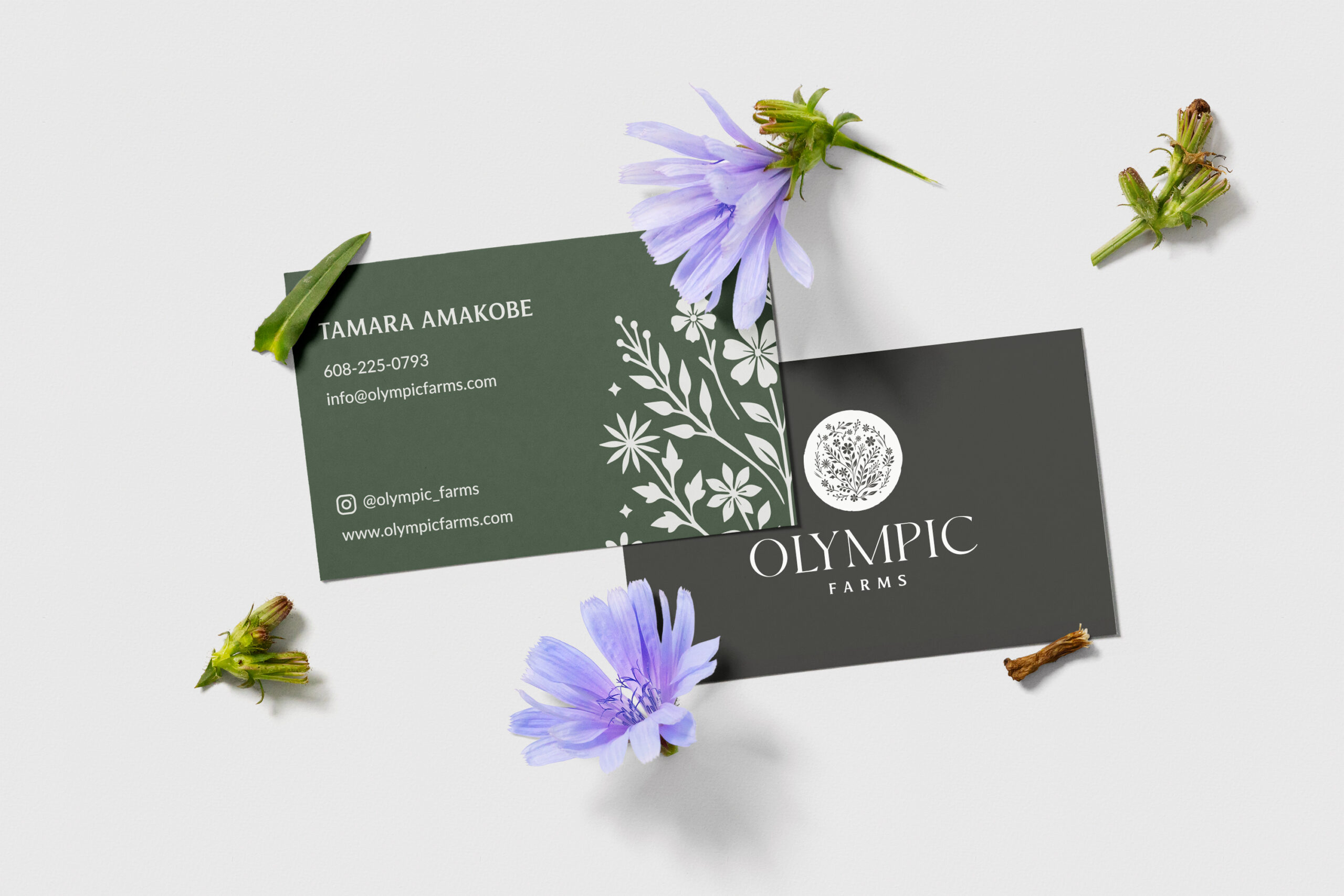
Business cards: Print-ready design on premium stock — brand-consistent and intentional, built to hold up in every in-person interaction.
EQUIP
The Squarespace website launched with five pages: Home, About, Shop (with CSA subscription and product listings), Journal (blog), and Contact. Apple & Anchor built it to be fully manageable by Tamara independently — and followed delivery with a 30-minute live training session so she had the confidence to run it herself from day one.
━━━━━━━━━━━━━━━━━━━━━━━━━━━━━━━━━━━━━━━━
05 // IN THEIR WORDS
“Well it made me cry. It’s everything. I’m so grateful for you, you have no idea… Jess, I can’t tell you, you have made a part of my dream possible. So much gratitude…”
— Tamara Amakobe, Owner | Olympic Farms
━━━━━━━━━━━━━━━━━━━━━━━━━━━━━━━━━━━━━━━━
06 // THE OUTCOMES
Complete Brand Identity
A full visual identity system — logo suite in multiple formats and color variations, brand style guide, color palette, typography system, and imagery direction — built to grow with the business.
Business Cards
Print-ready business card design on premium stock, giving Tamara a professional, brand-consistent touchpoint for every in-person interaction.
Five-Page Squarespace Website
A fully responsive website with e-commerce integration for CSA subscriptions and product sales, blogging capability for ongoing community storytelling, and a clean, brand-aligned design that builds trust before a visitor ever reaches the shop page.
Owner Training
A dedicated post-launch training session so Tamara can update, manage, and grow her own site confidently — no dependency, no bottleneck.
A Dream Made Visible
Perhaps most importantly: a brand that finally reflects what Olympic Farms actually is. Something Tamara can share with pride, point people toward, and build on.
━━━━━━━━━━━━━━━━━━━━━━━━━━━━━━━━━━━━━━━━
07 // THE TAKEAWAY
Not every brand project is about repositioning or differentiation. Sometimes it’s about taking something that already exists beautifully in someone’s heart and giving it a form the rest of the world can see.
That’s what Apple & Anchor did for Olympic Farms. We didn’t invent Tamara’s dream. We just helped her show it.
━━━━━━━━━━━━━━━━━━━━━━━━━━━━━━━━━━━━━━━━