Client
Magnolia Construction Group of TN
Services
Brand System —
Brand strategy, messaging framework, full visual identity, brand collateral, and custom website
Industry
Construction & Site Development
01 // THE CLIENT
Magnolia Construction Group of Tennessee is a construction and site development company operating in the Tennessee market. They came to Apple & Anchor at a pivotal moment: growing fast enough to need a real brand, but without any of the visual or strategic infrastructure to support that growth.
They had no existing logo, no messaging framework, no brand guidelines, and no website. Everything needed to be built — not refreshed, not iterated — built from scratch.
━━━━━━━━━━━━━━━━━━━━━━━━━━━━━━━━━━━━━━━━
02 // WHERE THEY STARTED
Starting from zero is both a challenge and a gift. There’s no legacy baggage to work around — but there’s also no existing equity to build on. Magnolia Construction had a strong business and real expertise in their field. What they didn’t have was a way to communicate that credibility at first glance.
In an industry where trust is everything — where clients are handing over projects worth millions and timelines that can’t slip — a generic or absent brand signals risk. Magnolia needed to show up looking like the company they already were: capable, grounded, and serious.
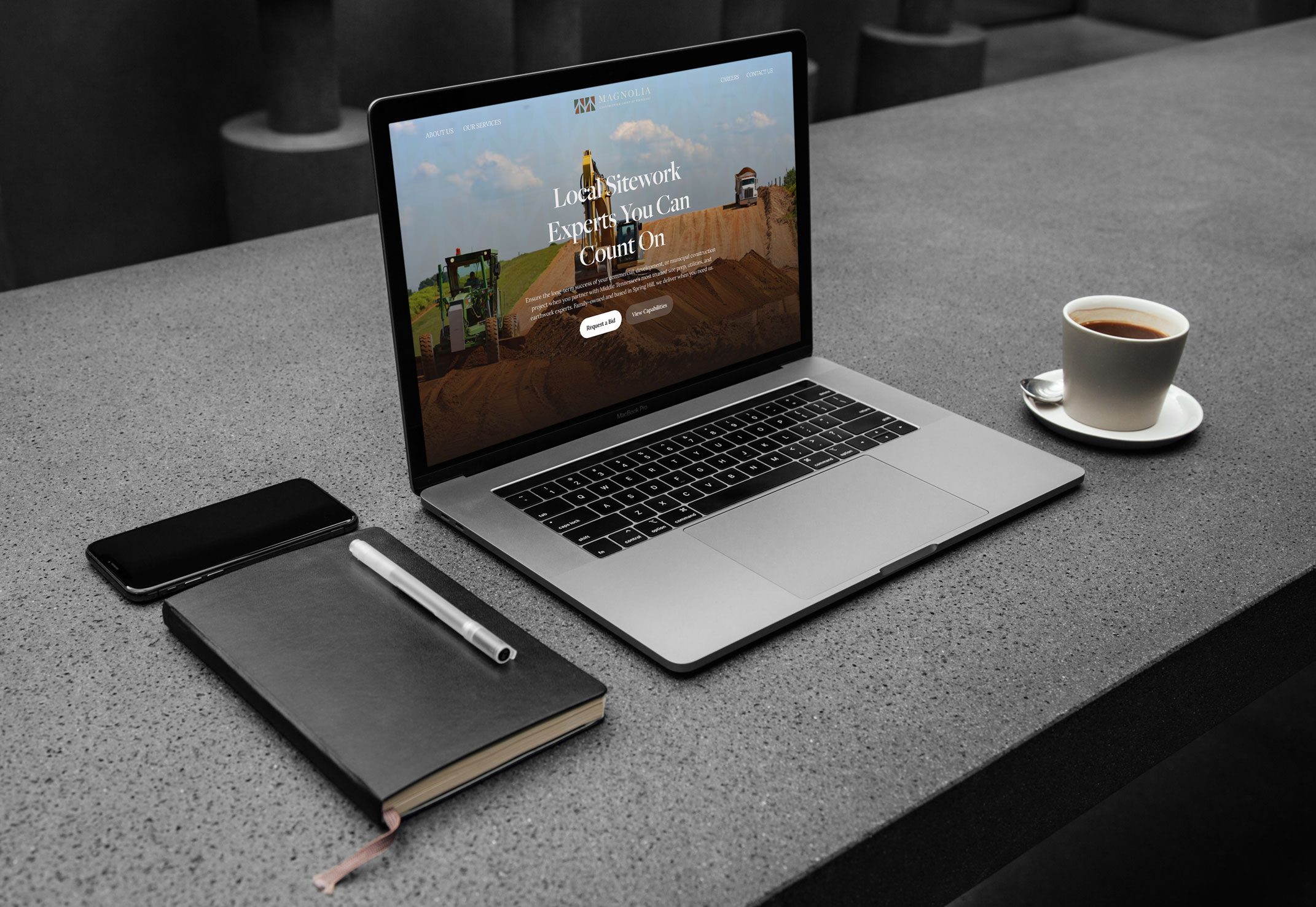
The ask was comprehensive: brand strategy, messaging, full visual identity, print collateral (business cards, letterhead), and a five-page responsive website. One engagement. One cohesive brand built end-to-end.
━━━━━━━━━━━━━━━━━━━━━━━━━━━━━━━━━━━━━━━━
03 // THE STRATEGIC INSIGHT
The construction industry defaults to two aesthetics: bold and aggressive (heavy machinery, high-contrast black and orange) or generic and forgettable (clipart hard hat, blue sans-serif). Neither builds the kind of trust that wins long-term contracts or attracts quality clients.
The insight that drove the creative direction: Magnolia isn’t just a construction company — it’s a Tennessee company with roots, standards, and staying power. The brand needed to communicate permanence and precision, not just capability. It needed to feel like the landscape it works in: grounded, natural, built to last.
That meant moving away from the typical construction aesthetic entirely and toward something more elevated — a brand that could walk into a boardroom or onto a job site and be equally credible in both settings.
━━━━━━━━━━━━━━━━━━━━━━━━━━━━━━━━━━━━━━━━
04 // THE ANTI-BORING BRAND FRAMEWORK™ IN ACTION
EXCAVATE
We started with a deep brand discovery process — interviewing the Magnolia team to understand not just what they build, but how they work, what they value, and what kind of clients they want to attract. The word that kept surfacing: reliability. Not just showing up on time, but being the kind of company clients call first because they know the work will be done right.
DISTILL
The brand truth we landed on: Magnolia Construction Group builds with precision, permanence, and pride — and their brand should reflect the same standard they hold their work to. Every element of the identity needed to feel considered and intentional, just like their approach to construction.
DIFFERENTIATE
The opportunity was clear: own a different lane entirely. While competitors leaned into industrial toughness, Magnolia could own refined authority — a brand that communicates expertise through restraint and quality rather than noise.
EXPRESS
The visual identity system was built to reflect the Tennessee landscape and the permanence of what Magnolia builds:
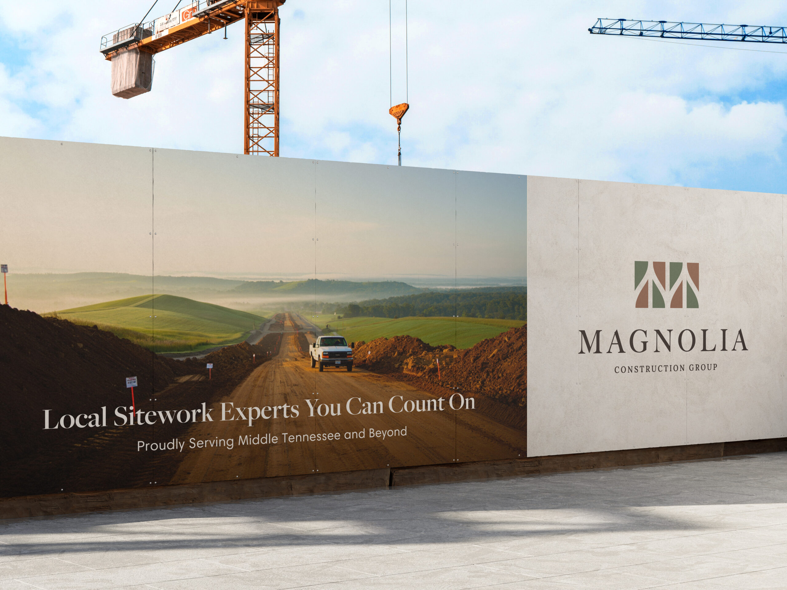
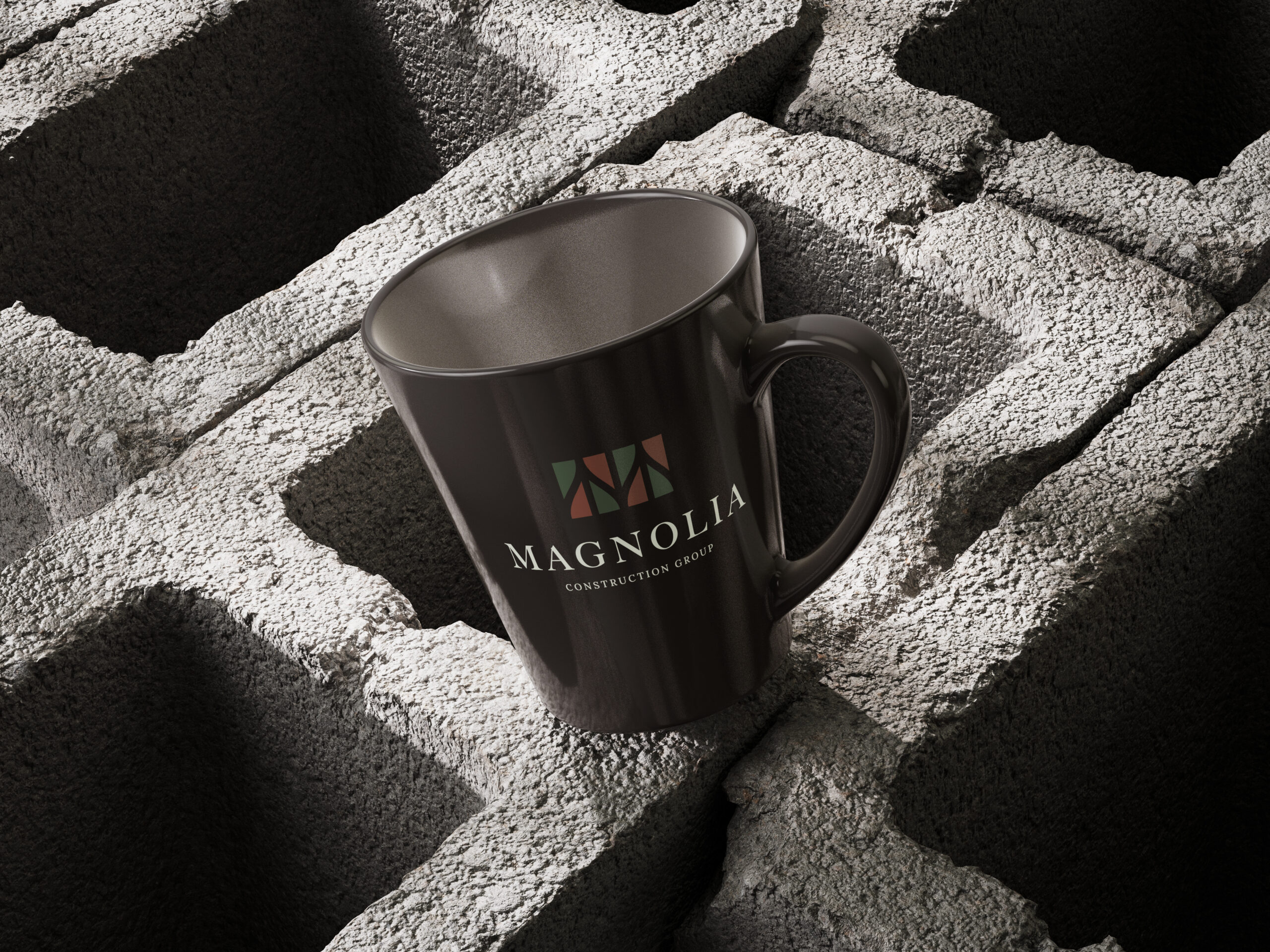
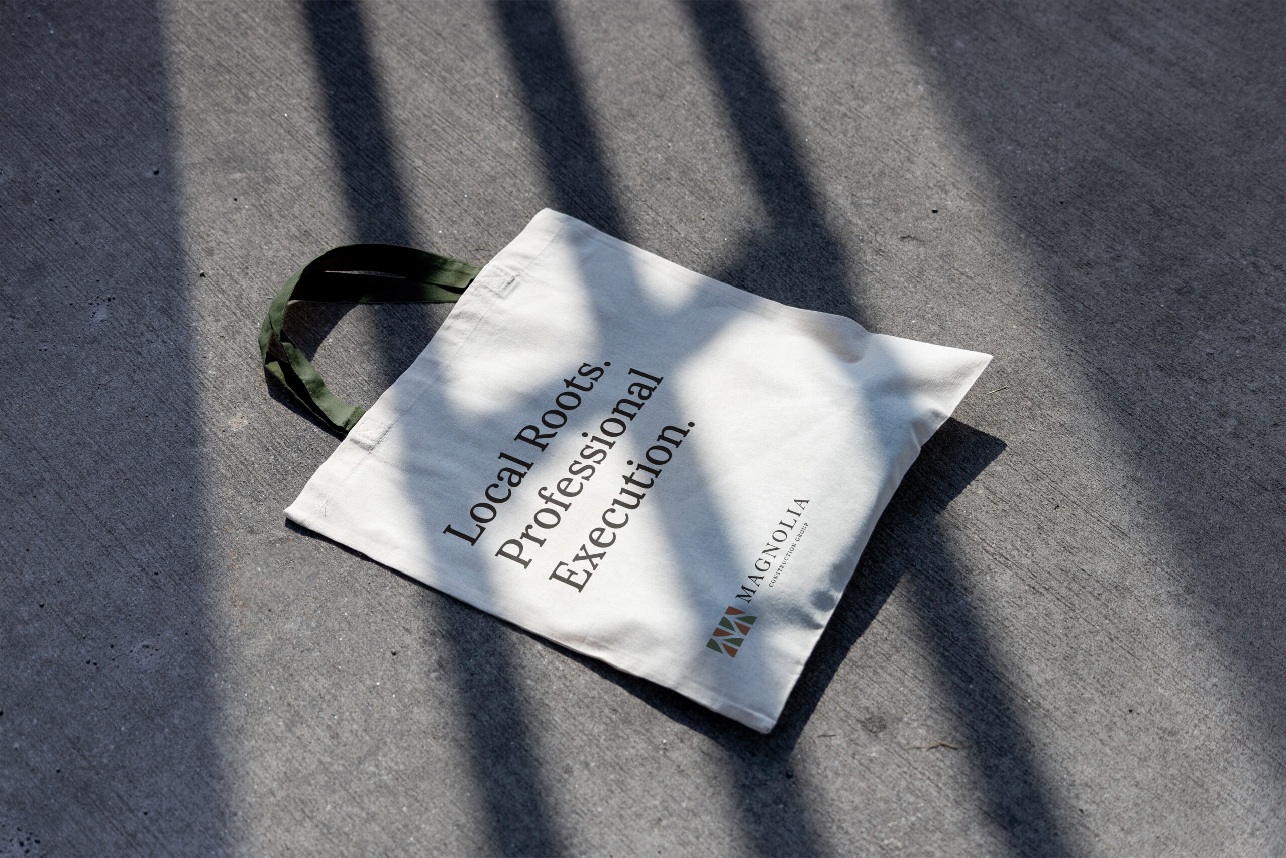
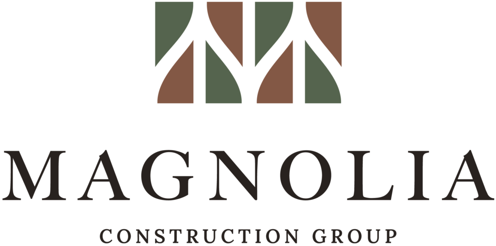
Logo suite: A geometric “M” icon constructed from angular, architectural shapes — evoking both the brand name and the precise, structured nature of construction. Available in light and dark versions, stacked and horizontal formats, badge/circle mark, and icon-only — five variations total, each purpose-built for different applications from job site signage to business cards to digital headers.
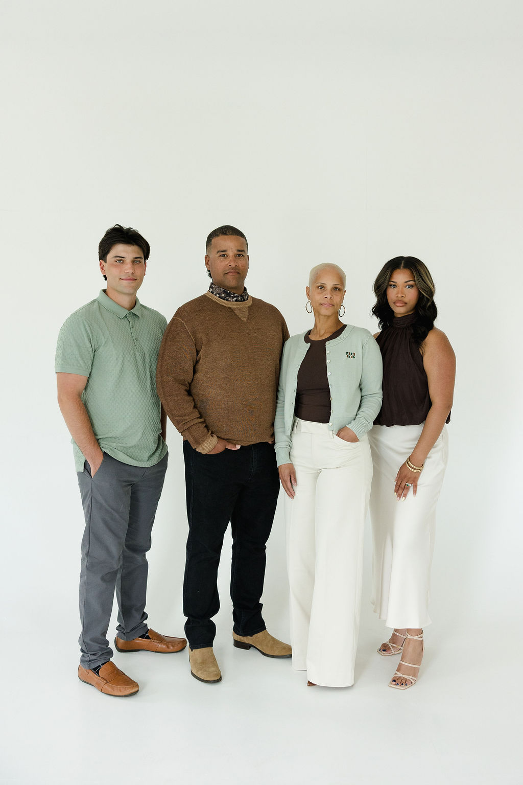
Color palette, typography, photo styling and fully custom website.
EQUIP
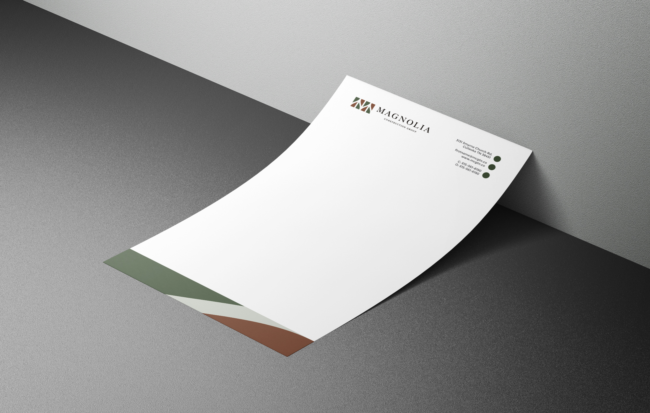
Magnolia left with everything they needed to operate their brand independently and consistently: foundational brand strategy, comprehensive brand guidelines, a full logo file suite (JPEG, PNG, PDF, EPS, all color variations), business card designs for three team members, letterhead design and a fully responsive five-page website.
━━━━━━━━━━━━━━━━━━━━━━━━━━━━━━━━━━━━━━━━
05 // IN THEIR WORDS
“The team at Apple and Anchor were a blessing to work with! They were on time and malleable to fit our needs.”
— Nasia Sampson, Public Relations | Magnolia Construction Group of Tennessee
━━━━━━━━━━━━━━━━━━━━━━━━━━━━━━━━━━━━━━━━
06 // THE OUTCOMES
Complete Brand Identity — Built from Zero
A full visual identity system created from scratch: logo suite with 5 variations in light and dark versions, a 6-color palette named for the Tennessee landscape, and a complete typography system — all designed to project authority and permanence.
Messaging Framework
Using the StoryBrand method: BrandScript, core mission/purpose/vision, brand personality and tone of voice, value proposition, key message copy blocks, audience personas, and calls-to-action. Magnolia now knows exactly what to say and how to say it.
Brand Collateral
Business card designs for 3 team members, letterhead design, and 500 printed letterhead sheets — ready for proposals, bids, and client communications that look as professional as the work they represent.
Five-Page Responsive Website
A modern, clean website designed to attract clients and potential employees — built on approved wireframes with brand-consistent fonts, colors, and copy. Fully optimized for both desktop and mobile.
Airtable ATS
A custom applicant tracking system built in-house to Magnolia’s exact specs and embedded in the website — with tailored tables, fields, and automations to manage candidates from first contact to hire. Team training was provided at handoff.
Brand Guidelines
A comprehensive guide covering logo usage, color application, typography specs, photo styling direction, and do’s and don’ts — so the brand stays consistent long after the project closes.
━━━━━━━━━━━━━━━━━━━━━━━━━━━━━━━━━━━━━━━━
07 // THE TAKEAWAY
When you’re building something from the ground up — whether it’s a road, a site, or a brand — the foundation is everything. Magnolia Construction Group came to Apple & Anchor without a brand. They left with a complete identity system that positions them to compete at a higher level, win better clients, and show up with confidence wherever the work takes them.
In construction, the quality of the build tells you everything about the builder. The same is true for a brand.
━━━━━━━━━━━━━━━━━━━━━━━━━━━━━━━━━━━━━━━━