Client
Hey Hey Creative —
Nashville-based event planning studio
Services
Brand System —
Full rebrand: logo suite, brand guide, WordPress website
Industry
Event Planning & Production
01 // THE CLIENT
Hey Hey Creative is a Nashville-based event planning studio founded by Gretchen Smith, CMP, DMCP — a certified meeting and destination management professional with deep expertise in corporate events, experiential activations, and celebration design. Their tagline says it all: Experience Creators + Magic Makers.
They came to Apple & Anchor with a brand that had genuine personality but was holding them back from showing up consistently and confidently in the market.
━━━━━━━━━━━━━━━━━━━━━━━━━━━━━━━━━━━━━━━━
02 // WHERE THEY STARTED
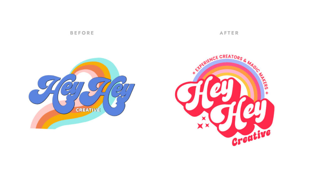
Hey Hey Creative had an existing logo with real soul — a retro rainbow mark with illustrated texture and layered script typography. The personality was there. But the execution created serious application problems.
The heavily textured, illustrated style with stacked scripty fonts was nearly impossible to reproduce consistently across touchpoints. It fell apart when scaled down to a social media avatar, broke on dark backgrounds, and couldn’t be cleanly embroidered, reversed, or applied at small sizes. The brand had good instincts — but wasn’t workable.
They also lacked a complete brand system: no defined color palette, no type hierarchy, no photo styling guidelines, and no flexible logo suite for different applications. What they had was a logo. What they needed was a brand.
━━━━━━━━━━━━━━━━━━━━━━━━━━━━━━━━━━━━━━━━
03 // THE STRATEGIC INSIGHT
The insight that shaped everything: this wasn’t a brand that needed to be replaced — it needed to be liberated.
The rainbow, the retro energy, the warmth and playfulness — those were already right. They were authentic to who Gretchen and her team actually are and how their clients experience them. The work wasn’t to invent a new identity. It was to take what was already true about Hey Hey Creative and build a system that could actually carry it.
That distinction matters strategically. When a rebrand preserves the soul while rebuilding the structure, clients feel continuity rather than whiplash. The brand stays recognizable to existing fans while finally becoming usable in the real world.
━━━━━━━━━━━━━━━━━━━━━━━━━━━━━━━━━━━━━━━━
04 // THE ANTI-BORING BRAND FRAMEWORK™ IN ACTION
EXCAVATE
We dug into who Hey Hey Creative is at their core — not just what they do, but how they make people feel. The word “magic” kept coming up, both in how they described their work and in what their clients said about them. That became a north star for the entire creative direction.
DISTILL
The core truth: Hey Hey Creative turns ordinary moments into unforgettable experiences — and they do it with infectious joy. Their brand needed to feel like a party you actually want to be at. Not polished-corporate. Not DIY-cute. Joyful, professional, and unmistakably them.
DIFFERENTIATE
In a market full of wedding-white event brands and muted neutrals, Hey Hey Creative had an opportunity to own bold. The retro-rainbow direction wasn’t a trend play — it was authentic differentiation that matched their energy and made them immediately recognizable.
EXPRESS
The new identity system was built around a vibrant, retro-inflected design direction with functional flexibility built in from the start:
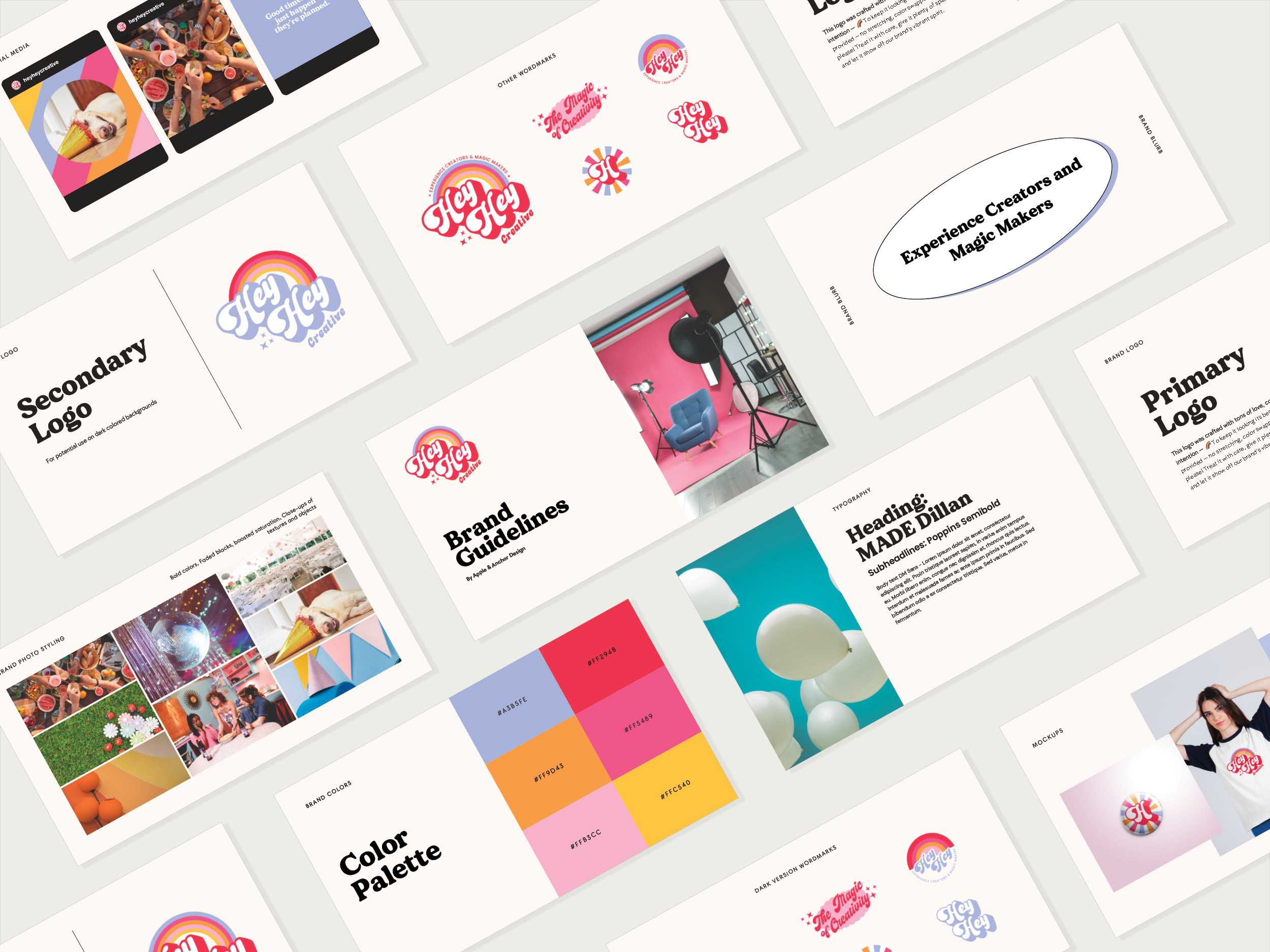
Logo suite: Primary full-color logo (red/rainbow), secondary periwinkle version for dark backgrounds, circle badge mark, “H” sunburst icon, script wordmark — six marks total, each purpose-built for different applications.
Color palette: Six colors — Electric Red (#FF294B), Hot Pink (#FF5489), Periwinkle (#A3B5FE), Amber (#FFC540), Peach (#FFC5B9), plus a warm off-white base. Vibrant but cohesive.
Typography: MADE Dillan for headlines (bold, retro personality), Poppins Semibold for subheadings (clean, readable), DM Sans for body copy (accessible at all sizes).
Photo styling: Bold colors, faded blacks, boosted saturation, close-ups of textures and objects — a distinct visual language that extends the brand beyond the logo.
EQUIP
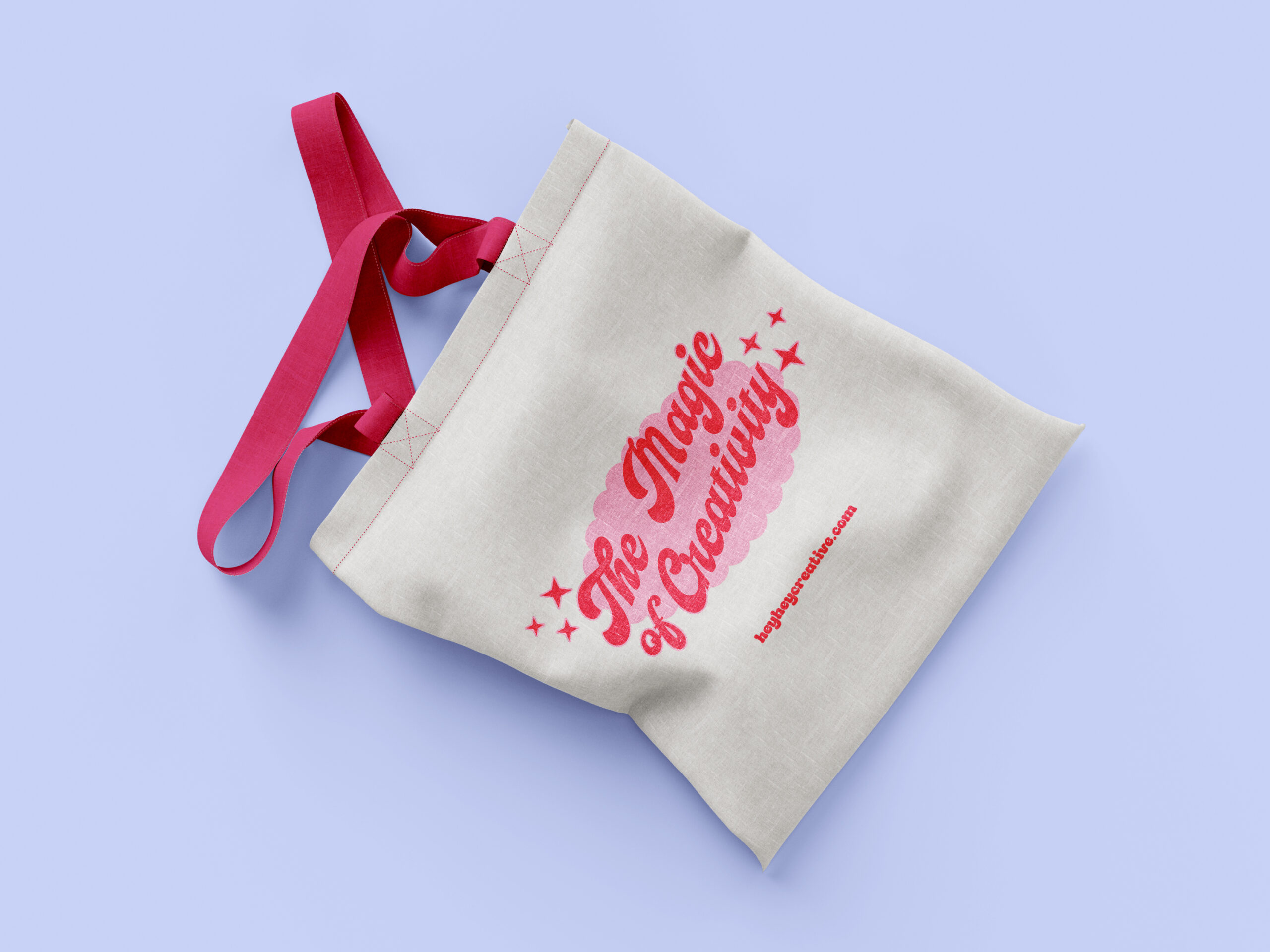
The brand guide delivered everything the Hey Hey Creative team needs to maintain consistency independently — logo usage rules, color codes, type specs, photo direction, and mockup examples across merchandise, social media, and stationery. Plus a new WordPress website to bring it all to life online.
━━━━━━━━━━━━━━━━━━━━━━━━━━━━━━━━━━━━━━━━
05 // IN THEIR WORDS
“After meeting Apple and Anchor a few years ago, we’ve been able to recommend them to several of our clients because of their creativity, fun, and outlook on all things branding. When we decided we needed a brand refresh and a new website, we knew we HAD to turn to Apple and Anchor. And BOY did they deliver! They made the entire process easy from beginning to end, even when we were too busy working IN the business and needed to work ON the business with them. 🙂 Highly recommend Apple and Anchor for branding/logos and website needs from us personally, and for other things we’ve recommended them to our clients for: programs, one-sheeters, logos, branding, graphics, and truly the list goes on and on.”
— Gretchen Smith, CMP, DMCP | Co-Founder, Hey Hey Creative
━━━━━━━━━━━━━━━━━━━━━━━━━━━━━━━━━━━━━━━━
06 // THE OUTCOMES
Complete Brand System
Full identity suite with 6 logo variations, defined color palette, type hierarchy, and photo styling direction — built to work across every touchpoint from day one.
Functional Versatility
Logo suite covers light backgrounds, dark backgrounds, small formats, embroidery, social avatars, and merchandise — no more workarounds or off-brand compromises.
Brand Guide
A comprehensive reference document that empowers the Hey Hey Creative team to apply the brand consistently and confidently without coming back for guidance.
New Website
A WordPress site that brings the full brand system to life and positions them to attract the caliber of clients their work deserves.
━━━━━━━━━━━━━━━━━━━━━━━━━━━━━━━━━━━━━━━━
07 // THE TAKEAWAY
The best rebrands don’t erase what came before — they honor it. Hey Hey Creative already had the magic. Apple & Anchor gave it a system that could hold.
When your brand finally matches your work, everything changes: how you show up in proposals, how you’re perceived at first glance, and how confidently you can say “this is who we are” — in any format, at any size, on any background.
━━━━━━━━━━━━━━━━━━━━━━━━━━━━━━━━━━━━━━━━